Targeted Display Best Practices
The best techniques to help produce optimal results for targeted display campaigns
Targeted display campaigns further enhance and impact other larger digital marketing campaigns.
Target a Relevant Audience
- Identify your goals, objectives, and target audience.
- Tailor your message to this audience and their interests. We'll promote your article to these audiences.
Have a Powerful Message
- Emphasize benefits in your messaging. Make sure the benefits are compelling and relevant to the audience you're targeting.
- If you're targeting a local audience, make it sure it's clear that your offerings apply to the audience.
- The messaging can be more important than the design, so make sure the verbiage is strong.
- Create a sense of urgency—use dates, times, and limited offers to prompt consumers to act
- Entice the customer to click the ad
Create Engagement
- Use keywords/buzzwords to catch attention
- A call-to-action is a MUST—3 words or less; consider placing your action on a button
Simplify Messaging
- Keep it simple, short, and sweet — 10 words or less; consider highlighting important words for bigger impact
- Consider animated gifs, with messages that rotate, if you may need a larger word count
- Remember that web ads are interactive. If a reader needs more information, they'll click (we want them to click!)
Design
- Keep it neat. Avoid cluttering the ads with too many words, too much imagery, etc.
- Select colors and fonts that match your brand
- Web ads are small. Choose fonts that are highly legible. Small copy "fine print" sized text may not be legible
- Include your brand name and/or a logo
- Include an attention-grabbing image that is legible at a small size
- Consider photos featuring people using or enjoying the product
- All ad sizes should represent the same look/feel/message
- Acceptable formats: JPG and animates GIFs
Keep Things Fresh
- Adjust the messaging to keep content fresh and engaging for the audience
- Artwork should be updated every 4-6 weeks
Example of bad ads 🚫
Here's an example of what you should NOT do.
These ads have too many words resulting in poor legibility, text that's too small, and ineffective/indirect messaging to the viewer.
Example of best practices ✅
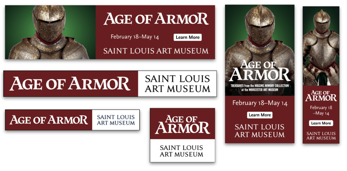
Saint Louis Art Museum's targeted display ads
Creative Set 1

Creative Set 2

- Target audiences: Culture, Design, Dining, Events, Family.
- Why they worked: Saint Louis Art Museum's campaign achieved success thanks to its simple and direct messaging, striking imagery, and strategic targeting of relevant audiences. The messaging was simple and efficient, giving the viewer just the right amount of information, which contributed to a clean aesthetic that is easily readable across all ad sizes. The use of visually compelling imagery further reinforced the subject matter of each exhibit. Moreover, the museum kept the content fresh by changing up their ads every month to promote their latest exhibit.